tl;dr I took some time to make a redesign of a new club logo for the soccer team Dalkurd. The key word for the remake is simplicty.
Since I’m quite a soccer fan I was really glad when a team from my home region managed to qualify for Allsvenskan which is the number one league Sweden. It’s not the team that I cheer for but still – they managed to go from the lowest division in 2004 to Allsvenskan in 2017. That’s quite impressive.
One thing that’s not equally impressive is their club logo. At least in my opinion. Dalkurd was formed in Borlänge, Dalarna in 2004 and I think they’ve had the same logo since.

Anyways, if you are one of the better soccer clubs in Sweden I think you should have a better visual appearance as well. I had an idea a while ago to make a new design, just for fun, for Dalkurd. But I never took the time to do it. At last I managed to take some time and below I will show you what Dalkurd could look like.
I haven’t spent that much time with this. But I think it shows the potential of what the club could look like. Another thing worth mentioning is that I didn’t strip any information out from the original logo. I just tweaked it a bit.
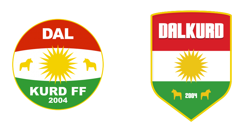
First of all I wanted to get away from the circle shape. The thing that really bothers me is the bars that are somewhat spherical inside of the circle. It alos bothers me that the name Dalkurd is split in half. The first half is on the top and the second half is in the bottom. I believe it would be better if the name was in one piece.
Let’s get too it. For the very base I made a shape of a shield. A lot of sports team uses a shield for their logo. And I tought Dalkurd could have one too. Also it gives somewhat of a more genuine/old feel to the club. Something more respected imo.
Except for the base shape the inside is the same as the current logo.
The same yellow color that’s in the star is also used as a border holding the shape together. Inside of the shield I put the kurdish flag – just as it is in the current circular logo. The difference is basically that the sphere is missing and the fields now have straight edges. No more spherical stuff going on.
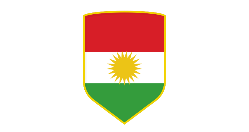
With the new shield and a straight flag inside of it. There’s a few more elements we need to add. At the moment we miss the name, which is kind of important. And preferably a name that’s not split in half.
We also miss the year 2004, in which the club was founded, and we miss the two horses. The Dala horse is a really famous symbol both for Sweden as well as for the region Dalarna. And as I mentioned earlier I don’t want to strip any of the current elements out from the redesigned version.
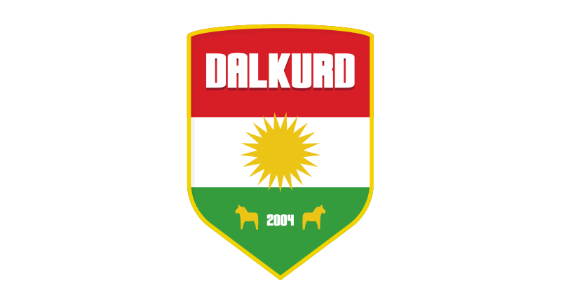
For the typography of the name I chose to use one of my own designed fonts. It’s not completely done yet, but the idea of it is to be used for names that should be written in a bold way. So I thought I’d give it a try here. I might try another font in the future. But for now the “Fat Tire” font works out quite good.
In the current logo the name says Dalkurd FF, and it’s written out in Arial Black. I don’t know which is worse – the splitting or the use of Arial. Anyways, I chose to skip the FF part in my version. Mostly because of saving space, and it’s not really necessary to add the suffix to the logo. (FF is short for “Fotbollsförening” )

So for the top part, in the red area, I write out the name of the club without the FF. And without splitting the name in two parts. In the white area I’m keeping the star, and for the green bottom area I write out the year and the two horses is placed to the left and right.
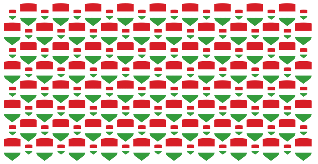
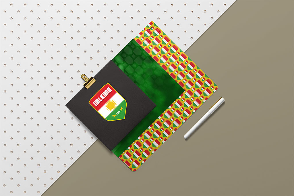
I really like the simplicity of the shield and I tried making a pattern with a simple colored version of the shield. Before the shield pattern I tried out a lot of different versions with making a pattern out of the stripes. Didn’t turn out as I wanted though.
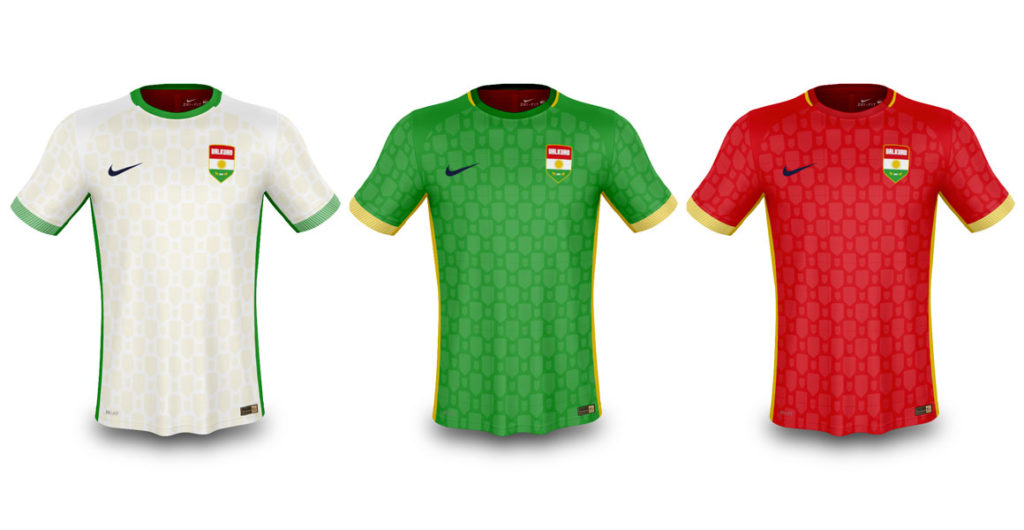
I found a PSD mockup for soccer jerseys so I tried adding my new elements to it. The base colors for the shirts is of course either white, green or red. But the simplified shield pattern could be used as a solid version with a low opacity – just to give the jersey some texture.
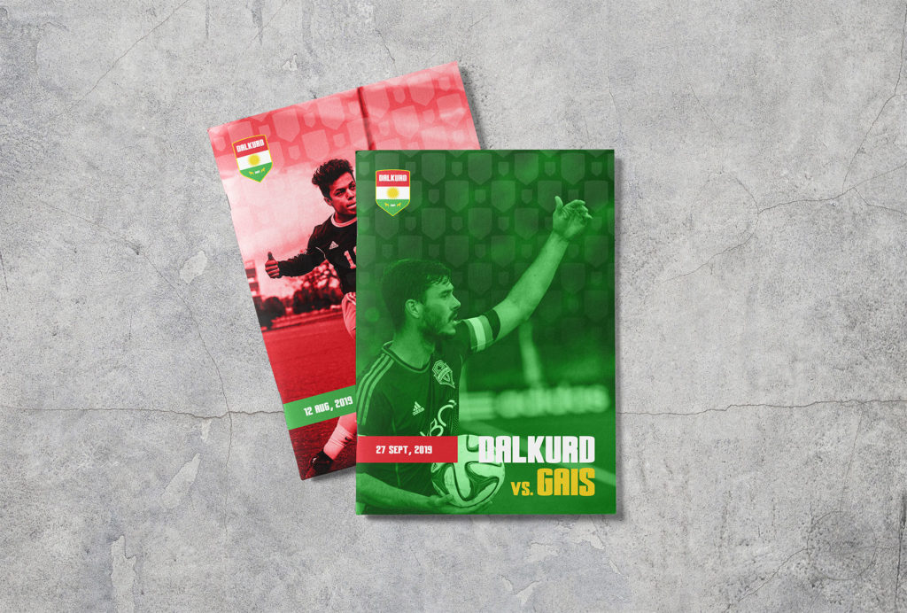
I’m also thinking that the more simplified shield would work great for small usages such as for app icons, favicons or other places that a small images is needed. Below is a quick design for a match programme. Yet the simplicity is in focus. Mono colored fronts in either red or green, quite large typography showing the game and date and a subtle use of the shield pattern on top of the image. Thanks Unsplash for the photos.
Of course there a lot of things missing and a lot of things that could have been done differently. But this is my quick take on a redesign for the swedish soccer team Dalkurd. Hope you enjoyed it!