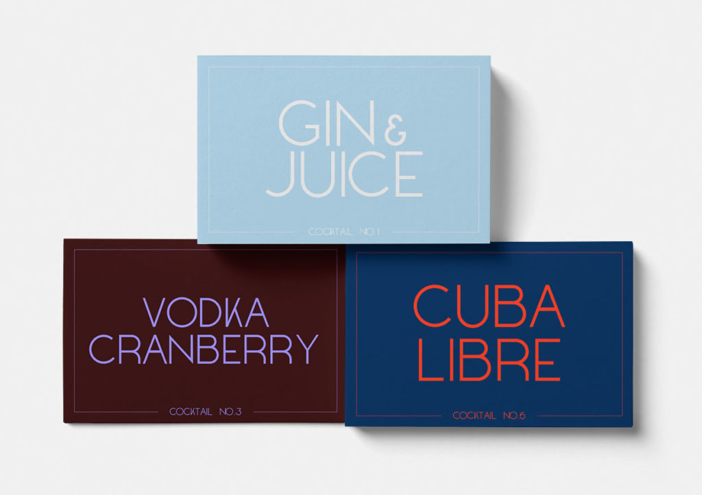
A friend of mine gave me the advice to think of how a font could be used before starting designing it. Which is kind of obvious. But previously I sometimes just started to create shapes of letters and the letters then formed the typeface – without having a certain use case for it in mind.
For this font I wanted to create something that could work on labels, or for menus, for drinks and cocktails. I was aiming for a clean sans-serif with an old retro classy feel to it. Imagine a classic font from the 20’s or 30’s ish.

At the moment most of the uppercase letters are done. And also most of the numbers. I’m still struggling with the captial S (which in my mind always is a tricky letter), as well as the numbers 2, 4 and 5.
Well, this is what it looks like for now. I will continue working with the remaining letters. And also try to come up with a good name for this font.