In the first blog post I hinted about a new typeface that I’ve been working on. I’ve come along pretty well, and now the lowercase letters are about done. I don’t think I will go on and create the uppercase letters.
These letters will work out fine with just lowercase – and the numbers.
I will have to add some more latin characters though.
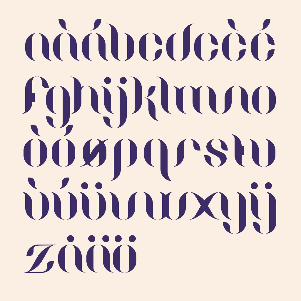
As well as the letters I also created a pattern. A pattern that is based on the different forms that the characters are based upon. I think it turned out really nice actually.
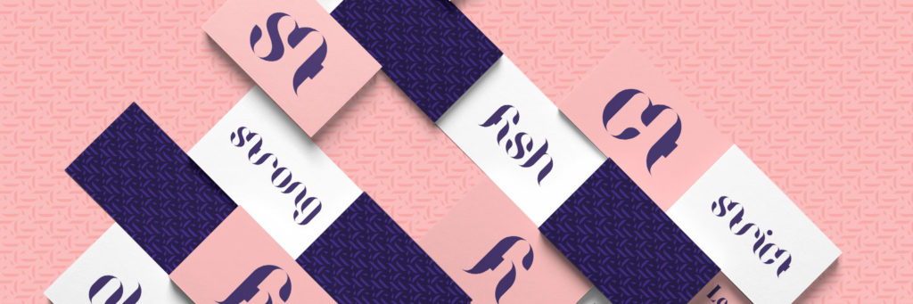
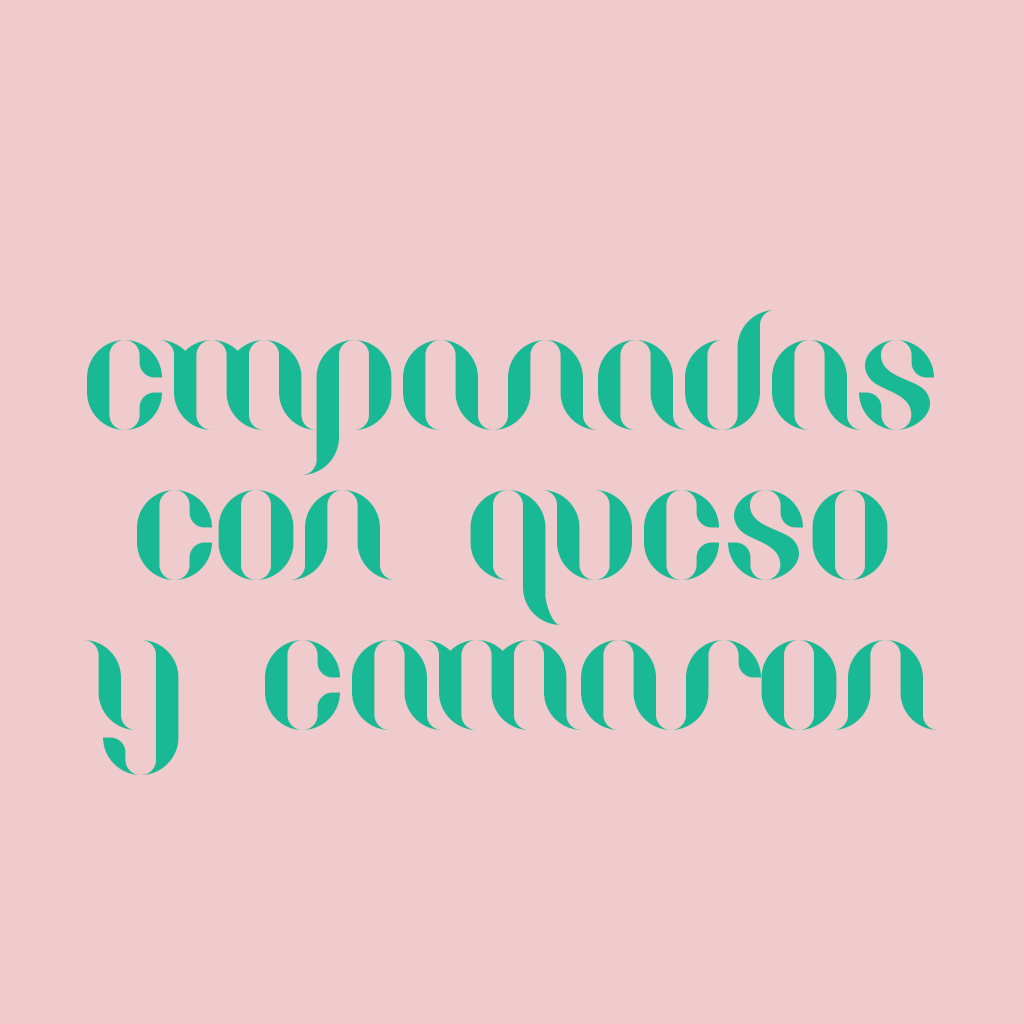
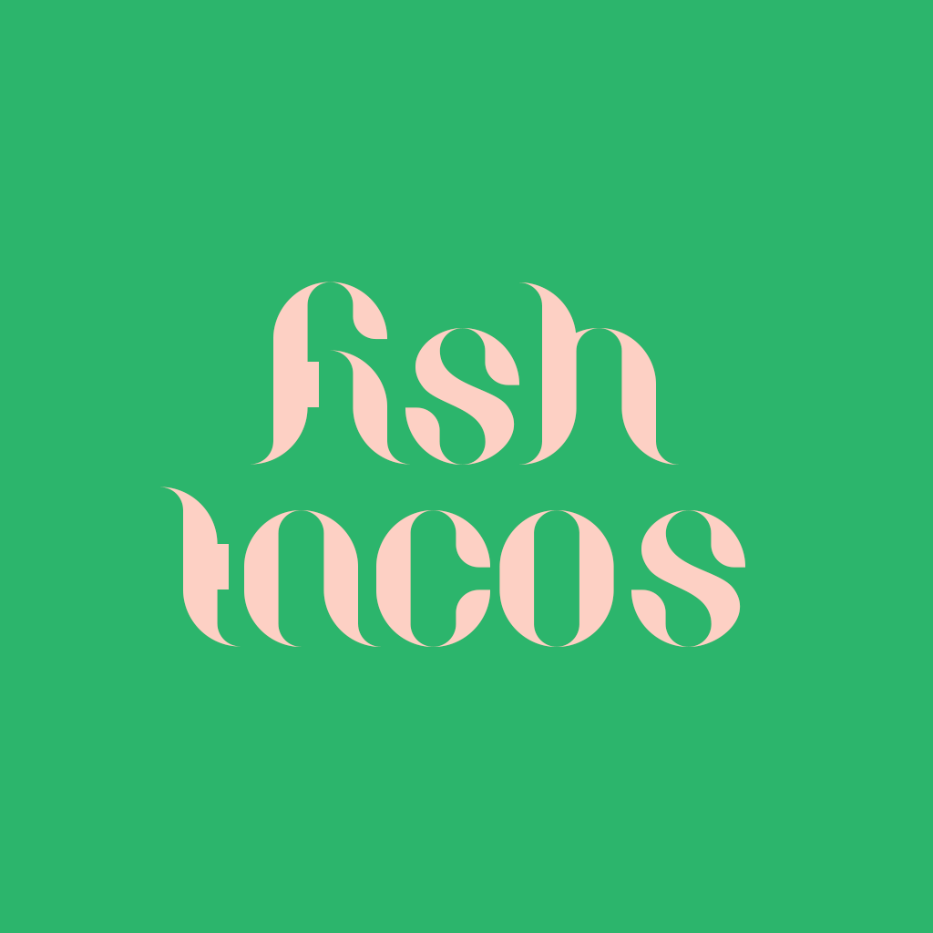
Maybe this font could be used for short names, or why not an album cover. Below are some images of the wording, and coloring, for a mexican inspired food menu.

One thing left to be done is to come up with a good name for the font. But I guess I have some time to figured that out. There’s still some kerning and tweaking to do. If you want to try the font out yourself, please visit my case page and have a closer look.